
Blog
Matchy Names: how I turned a feature of my app into a standalone web experience
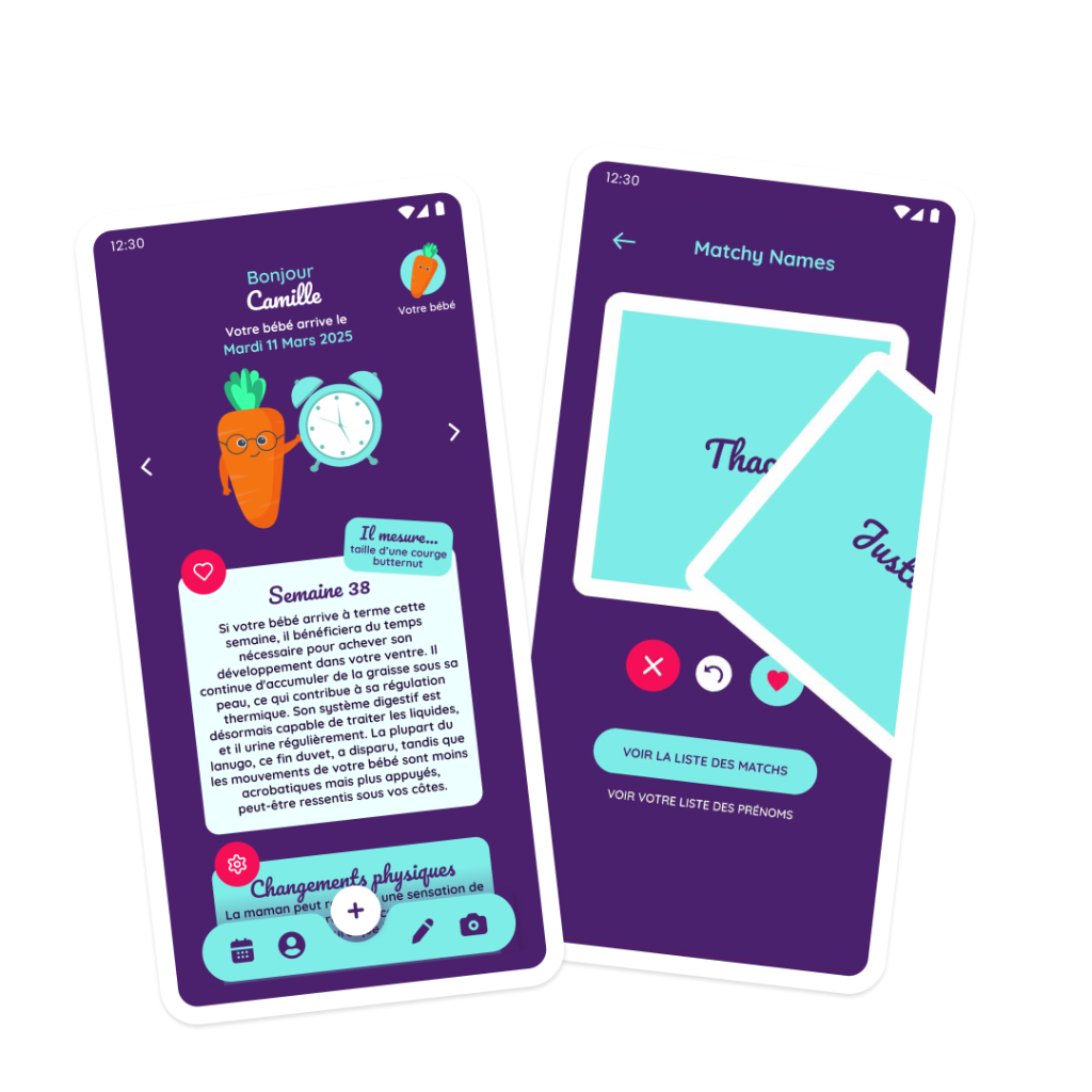
When I design a digital product, I often notice that certain features stay tucked away in a corner of the app, loved by the people who find them, but invisible to everyone else. That’s exactly what happened with Matchy Name, a little gem inside my app Coogli, a pregnancy and baby tracking app. In this UX case study, I’ll walk you through how this feature became Matchy Names, a standalone web experience, and more importantly, how I approached its design from a user experience point of view.
The starting point: an underused feature
Inside Coogli, Matchy Name lets two future parents swipe through thousands of baby names on their own, a bit like a dating app, and discover their “matches” whenever they agree on a name. A simple, playful mechanic that already worked really well… but only for people who had already downloaded the app.
The UX problem was clear: I was asking potential users to clear a fairly high bar (downloading a full pregnancy tracking app) just to access a one-off feature that could appeal to a much wider audience, including people who weren’t looking for a full tracking tool yet. Plenty of couples simply want baby name ideas, without needing the whole Coogli ecosystem around it.
That observation is what kicked off the project: what if I pulled Matchy Name out of the app and turned it into a web experience anyone could access in seconds, no download, no mandatory account ?
Rethinking the user experience, not just porting the feature
The first mistake would have been to simply copy and paste the existing feature onto the web. A mobile experience built into an app and a standalone web experience don’t share the same constraints or the same user expectations.
So I went back to the drawing board, focusing on a few clear UX principles:
- Cut entry friction to the bare minimum. On the web, every extra click or field before the main action loses users. So I made the choice to let people start swiping right away, solo, no email, no password, no account. Account creation only comes in later, and only to invite a partner, a moment when motivation is already there.
- Keep the mechanic that works, but make it obvious. The swipe gesture is instantly understood by almost everyone today, thanks to dating apps. I used that as a mental shortcut: no need to explain how to play, the interface speaks for itself.
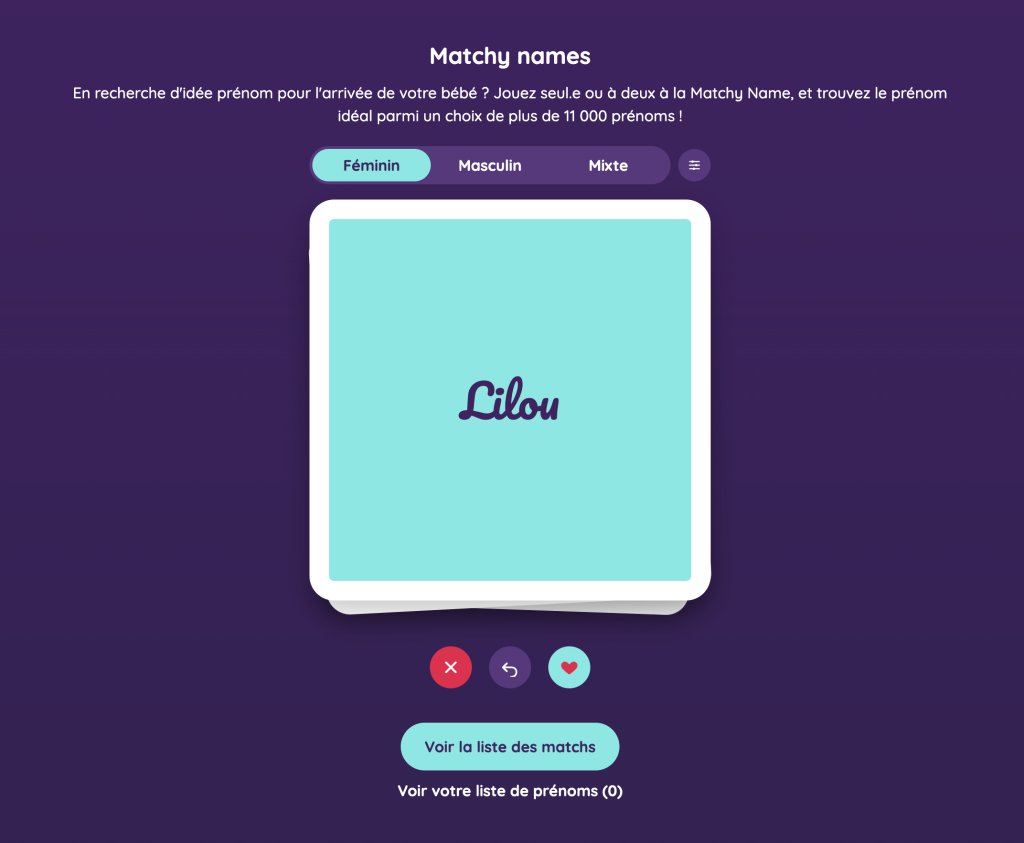
- Think mobile-first, for real. Most future parents discover this kind of tool on their phone, often during a spare moment (a waiting room, public transport, the couch in the evening). I designed every screen for the small screen first, making sure the main action (the card to swipe) is always visible without scrolling.
- Make the duo mode feel desirable, not just functional. Inviting your partner to play at the same time needed to be an enjoyable experience in itself, with a clear confirmation, a polished invitation email, and a real moment of visual celebration when a match appears.
From Figma wireframes to a live web app
As with all my projects, everything started in Figma. I built the full mockups for every screen there, from the swipe deck to the payment modal, including the search filters by origin, gender, and name length, and the match screens between partners. That mockup work let me validate the user flows before writing a single line of code: the solo flow, the duo flow, resending an invitation, recovering access by email.
The development side was then handled with Claude Code, Anthropic’s coding agent. Instead of starting with a long, costly traditional development cycle, I was able to iterate very quickly between design and technical implementation: a React front end that matches the Figma mockups pixel for pixel, an Express back end and a MySQL database to manage game sessions and matches, and a Stripe integration for the paid duo access (a paid feature to help fund the service, while the core game stays free to play solo).
Working this way let me stay constantly in the UX decision loop: every screen that got built could be adjusted immediately, pixel by pixel, against my design intentions, with no middleman and no endless back and forth with an external development team.
The UX decisions that make the difference
A few decisions are worth detailing, because they show what it really means to design with the user at the center.
Ad blocker detection, for instance, isn’t just a technical detail: it protects the service’s business model while staying transparent for the person playing, with a clear message instead of a silent, frustrating block.
Making the app trilingual (French, English, Spanish), with automatic language detection and a default name deck adapted accordingly (French female names on the FR version, English on the EN version, and so on), answers a real need: Coogli speaks to an international audience, and the experience needed to adapt without any extra effort from the user.
Finally, the choice of colors, typography, and micro-interactions (the card flying off when you swipe, the way a match is staged on screen) isn’t just decoration: it’s what turns a simple list of names into a moment worth sharing with your partner.

The result
Matchy Names is now live, playable straight from a browser, no download needed, at matchy.coogli.com. I think it’s a good example of how you can take an existing feature, look at it with a real UX eye, and turn it into a standalone product that finds its own audience, while staying connected to where it came from: Coogli, the app that supports parents from pregnancy through tracking their baby.
If you’re working on something similar, turning an existing feature into a standalone product, or more broadly a user experience redesign, feel free to reach out. It’s exactly the kind of problem I love solving.
